-
Tips for becoming a good boxer - November 6, 2020
-
7 expert tips for making your hens night a memorable one - November 6, 2020
-
5 reasons to host your Christmas party on a cruise boat - November 6, 2020
-
What to do when you’re charged with a crime - November 6, 2020
-
Should you get one or multiple dogs? Here’s all you need to know - November 3, 2020
-
A Guide: How to Build Your Very Own Magic Mirror - February 14, 2019
-
Our Top Inspirational Baseball Stars - November 24, 2018
-
Five Tech Tools That Will Help You Turn Your Blog into a Business - November 24, 2018
-
How to Indulge on Vacation without Expanding Your Waist - November 9, 2018
-
5 Strategies for Businesses to Appeal to Today’s Increasingly Mobile-Crazed Customers - November 9, 2018
Apple Online Store Redesigned To Merge With Product Pages
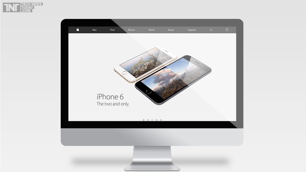
The redesigned Apple website is now visible to everyone on the planet. He likened the old site to a shop that had a showroom in the front and a sales room in the back, pointing out that the two had now been stuck together. Earlier, Apple provided information on its main website about the products and users were redirected to Apple Store in case they wanted to buy any product.
Advertisement
Unfortunately, the changes won’t make much of a difference to regions like India where Apple does not sell its products directly.
For Apple, its three major product lines are the iPad, iPhone and Mac.
Having both sites rolled into the one streamlines the shopping experience somewhat by allowing users to purchase goods from the same page they would visit to find out about those products.
Apple.com now showcases a shopping cart icon on the top right hand corner of the webpage.
“We redesigned Apple.com knowing that our customers want to explore, research and shop in one place”, Apple said in a statement, according to TechCrunch.
By clicking the buy button, it also shows all the configurations and variants, related accessories and extended warranty. The accessory page has also been revamped, listing with new layouts, recommendations, and categories.
Apple’s online retail experience, which sees over 1 billion shoppers pass through annually, was previously a separate site Apple shuttled shoppers to once they clicked shortcuts on Apple.com like the “Store” button on the company homepage.
Advertisement
Apple changes the images and information on Apple.com every time a new product is announced, but rarely does the Cupertino, California, company pull off overhauls like Thursday’s. But now all that is gone as showroom and store have been merged into one.


