-
Tips for becoming a good boxer - November 6, 2020
-
7 expert tips for making your hens night a memorable one - November 6, 2020
-
5 reasons to host your Christmas party on a cruise boat - November 6, 2020
-
What to do when you’re charged with a crime - November 6, 2020
-
Should you get one or multiple dogs? Here’s all you need to know - November 3, 2020
-
A Guide: How to Build Your Very Own Magic Mirror - February 14, 2019
-
Our Top Inspirational Baseball Stars - November 24, 2018
-
Five Tech Tools That Will Help You Turn Your Blog into a Business - November 24, 2018
-
How to Indulge on Vacation without Expanding Your Waist - November 9, 2018
-
5 Strategies for Businesses to Appeal to Today’s Increasingly Mobile-Crazed Customers - November 9, 2018
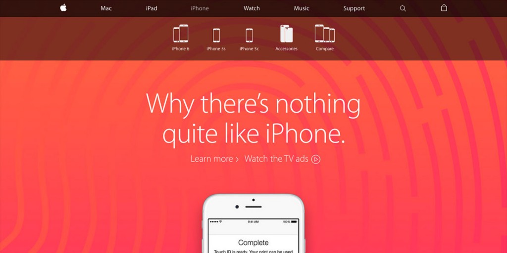
Apple redesigns website removing the Apple Store
The new design is now more inclusive in the sense that buying buttons now come up on the product page itself, unlike previously, when product pages were only to showcase Apple’s devices and they had to be bought by separately visiting the store.apple.com domain. Earlier, Apple provided information on its main website about the products and users were redirected to Apple Store in case they wanted to buy any product.
Advertisement
This shake-up sees purchasing buttons peppered around every product page, streamlining the process of buying a gadget by negating the need to click through from product sections to purchase page. There is no longer a standalone store.apple.com website that is used for making purchases, and the “Store” tab that was once at the top of Apple.com has been removed. Just check out their E-Commerce Checkout Usability reports for more details if interested.
The only (minor) twist, is that Apple now places its gadgets in silos online. That is due to two sites being collapsed into one. Usually, Apple Store is pulled down whenever Apple is scheduled to launch a new product, and people have all sorts of theories behind this rather unusual process.
The new layout is much simpler than the old site. The new look, which is the first major update to the site in some time, went live Thursday afternoon. A drop-down menu is invoked by clicking on it, and it comes with links to the user’s “bag”, favorite items, orders, and account information and an option to log out.
Advertisement
If you’re wondering why Cupertino has decided to merge its virtual storefront and warehouse after all these years, an Apple spokesperson told TechCrunch that it’s “to give customers one simple destination to learn and buy without navigating between two different sites”.


